
- Home
- Portfolio
Portfolio
Real Results. Real Websites.
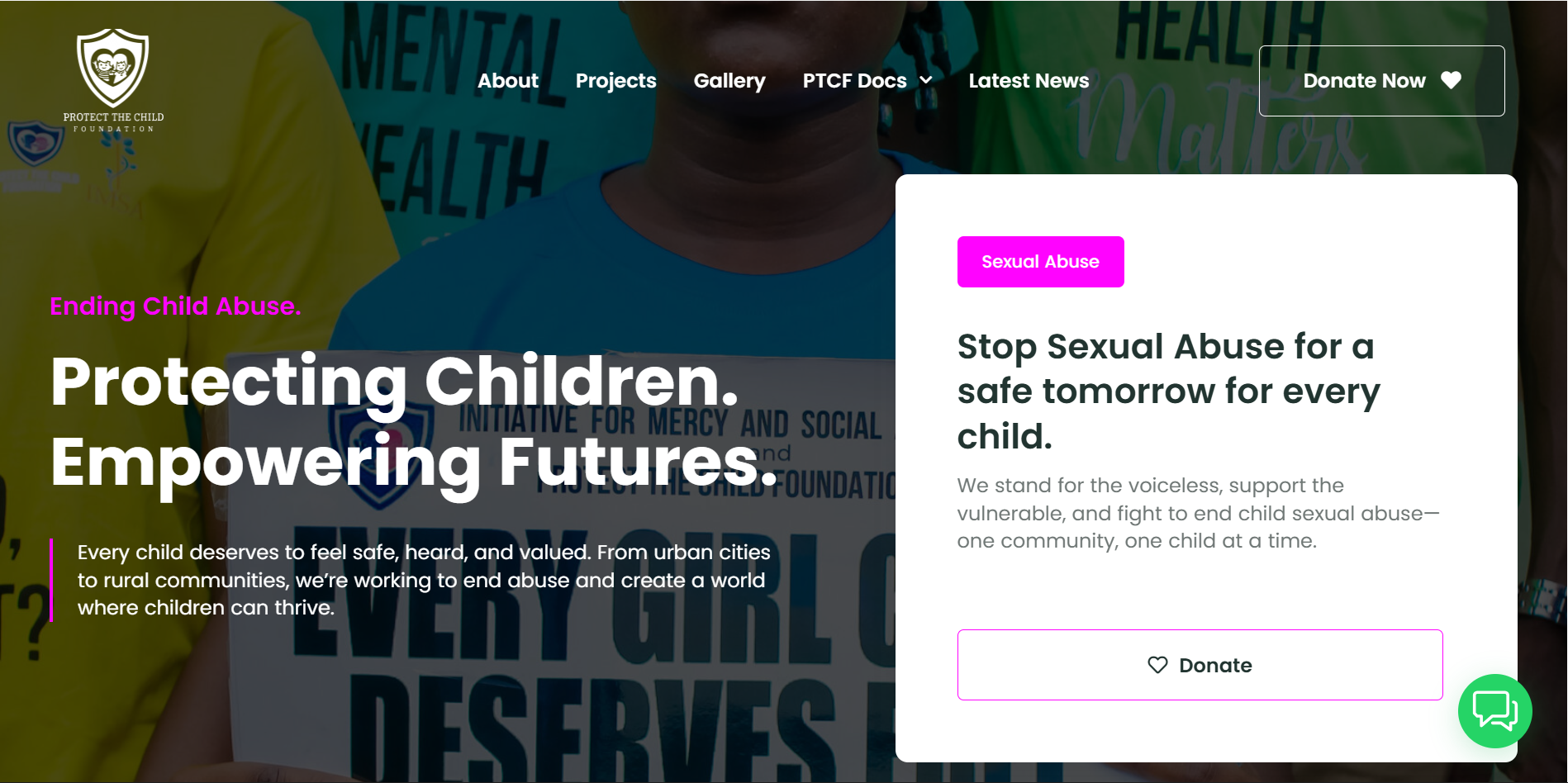
Project: Website Design for Protect the Child Foundation
This project involved designing a professional and compelling WordPress website for the Protect the Child Foundation, a Nigerian-based NGO dedicated to ending child abuse and advocating for children’s rights.
The Goal 🎯
The primary objective was to create a trustworthy and user-friendly online platform. The website needed to clearly communicate the foundation’s vital mission, showcase their impact, and encourage visitors to get involved through donations and volunteering.
Design Strategy & Solution 💡
My design approach focused on building credibility and creating an emotional connection with the user.
User Experience (UX): I developed a clean, structured layout with intuitive navigation. This ensures that visitors can easily find critical information about the foundation’s programs, impact stories, and ways to contribute.
Visual Design (UI): The visual identity was crafted to be both professional and hopeful.
Color Palette: A professional color scheme was chosen to inspire trust and confidence, while using warm accent colors to convey hope and care.
Typography: Clean and legible fonts were selected to ensure the important information on the site is accessible and easy to read.
Imagery: Powerful and positive imagery was strategically used to highlight the foundation’s successful work and the resilience of the children they support, fostering an empathetic connection.
Call to Action (CTA): Prominent and clear calls-to-action are placed throughout the site, making it simple for users to donate, learn more about specific programs, or sign up to volunteer.
The Outcome ✨
The final result is a professional, empathetic, and impactful website that serves as a powerful tool for the Protect the Child Foundation. It effectively tells their story, builds trust with visitors, and provides a clear pathway for community engagement and support.
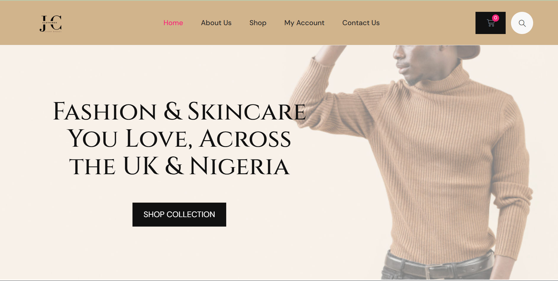
Project: E-Commerce Website Design for Jibson Clothing
This project involved designing a modern and intuitive e-commerce website for Jibson Clothing, a UK-based fashion brand. The solution was built on the WordPress platform, creating a seamless shopping experience for customers and a simplified management system for the client.
The Goal 🎯
The primary objective was to develop a high-performance, user-friendly e-commerce store that would serve as a significant upgrade from their previous site. Key goals included improving site speed, enhancing the customer journey from browsing to checkout, and providing the client with an easy-to-use backend for managing products and content within WordPress.
Design Strategy & Solution 💡
My design approach focused on creating a clean, visually appealing, and highly functional online store that reflects the brand’s modern aesthetic.
User Experience (UX): I prioritized a frictionless shopping experience. The website features a clear and logical navigation structure, making it simple for customers to browse product categories, view item details, and complete their purchase. The checkout process is streamlined to minimize cart abandonment.
Visual Design (UI): The visual design was crafted to be stylish and contemporary, allowing the products to be the main focus.
Color Palette: A minimalist and chic color palette was likely used, employing neutrals like black, white, and gray to ensure the vibrant colors of the clothing stand out.
Typography: Modern, clean, and highly legible sans-serif fonts were selected to ensure readability and complement the brand’s sophisticated style.
Imagery: The design is built around high-quality, professional product photography and lifestyle images that showcase the clothing in an appealing and relatable way.
Call to Action (CTA): Prominent and intuitive calls-to-action such as “Shop Now,” “Add to Cart,” and “Proceed to Checkout” are strategically placed to guide the user through the sales funnel.
The Outcome ✨
The final result is a fast, aesthetically pleasing, and easy-to-navigate WordPress website. The new design has enhanced the overall customer experience and significantly simplified the backend management process for the Jibson Clothing team, allowing them to update their site efficiently.
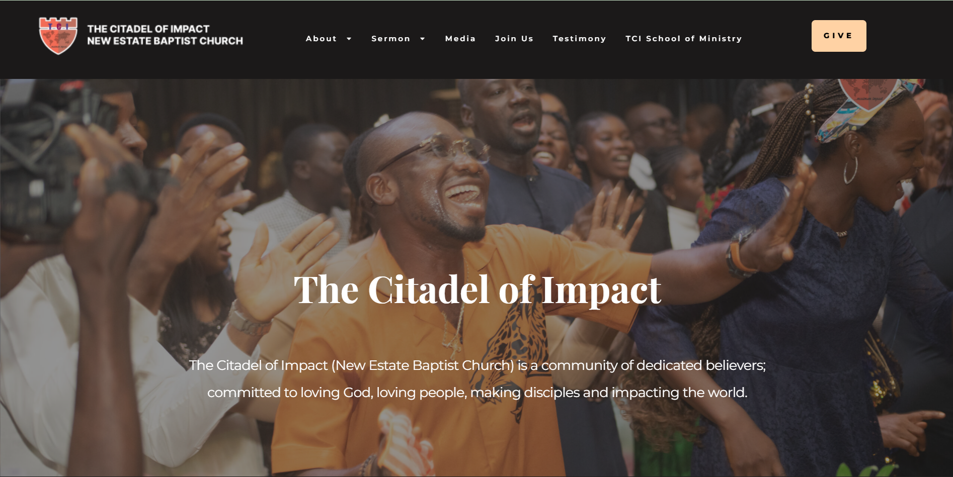
Project: Website Design for The Citadel of Impact
This project involved designing a professional and engaging WordPress website for The Citadel of Impact (New Estate Baptist Church), a faith, community-focused ministry.
The Goal 🎯
The primary objective was to create a welcoming and user-friendly digital ‘home’ for the church. The website needed to clearly communicate their core mission (“Loving God, Loving People, Making Disciples”), provide a central hub for their extensive media resources, promote services and events, and facilitate online engagement, including live streaming and digital giving.
Design Strategy & Solution 💡
My design approach focused on building a sense of community and providing easy access to spiritual resources.
User Experience (UX): I developed a clean, structured layout with intuitive navigation. This ensures that visitors and existing members can easily find critical information, such as service times, sermon archives, upcoming events, and details about their various ministries. The information architecture is designed to guide users seamlessly to resources like live streams, podcast links, and the TCI School of Ministry.
Visual Design (UI): The visual identity was crafted to be both professional and spiritually uplifting.
Color Palette: A professional and hopeful color scheme was used, combining clean whites and deep blues with warm gold accents to create a welcoming and reverent atmosphere.
Typography: Clean and highly legible fonts were selected to ensure all sermon titles, blog posts, and event details are accessible and easy to read.
Imagery: High-quality, positive imagery of the congregation, leadership, and church events is used strategically to foster a sense of community and active participation.
Call to Action (CTA): Prominent and clear calls-to-action are placed throughout the site, making it simple for users to “JOIN US” (live stream), “GIVE” online, download sermons, or “VIEW ALL EVENTS”.
The Outcome ✨
The final result is a professional, engaging, and impactful WordPress website that serves as the central digital hub for The Citadel of Impact. It effectively tells their story, nurtures their growing community, and provides a robust platform for their digital ministry and global outreach.
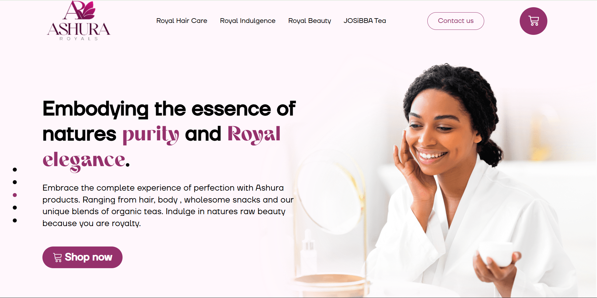
Project: E-Commerce Website Design for Ashura Royals
This project involved designing a sophisticated and inviting e-commerce website for Ashura Royals, a brand focused on “wholesome organic and natural products.” The site unifies multiple product lines—including beauty, hair care, organic teas, and natural snacks—under a single, elegant brand. The solution was built on the WordPress platform, utilizing its robust e-commerce capabilities.
The Goal 🎯
The primary objective was to create a trustworthy and user-friendly online store that embodies the brand’s tagline of “nature’s purity and Royal elegance.” The website needed to clearly showcase its diverse organic product range, create a premium shopping experience, and drive online sales by building customer confidence in their natural and wholesome offerings.
Design Strategy & Solution 💡
My design approach focused on building a clean, nature-inspired, and credible e-commerce environment.
User Experience (UX): I developed a clean, structured layout with intuitive navigation. This ensures that customers can easily explore the different “Royal” categories (Hair Care, Beauty, Indulgence, Tea) and find specific product information. The information architecture is designed to guide the user seamlessly from product discovery to a secure checkout.
Visual Design (UI): The visual identity was crafted to be both elegant and natural.
Color Palette: A professional and earthy color scheme was chosen, combining clean whites with natural tones (like greens and browns) and elegant gold accents to reflect the “Royal” and “organic” branding.
Typography: Clean and legible fonts were selected to ensure product descriptions and ingredient information are accessible and easy to read.
Imagery: The design relies on high-quality, professional photography of the products and their natural ingredients to foster a connection to nature and build trust.
Call to Action (CTA): Prominent and clear calls-to-action such as “Shop now,” “View More,” and “Add to Cart” are placed throughout the site to guide users and encourage purchases.
The Outcome ✨
The final result is a professional, elegant, and impactful WordPress website that serves as the central sales hub for Ashura Royals. It effectively tells their brand story, builds customer trust in their organic products, and provides a seamless and secure pathway for global e-commerce.
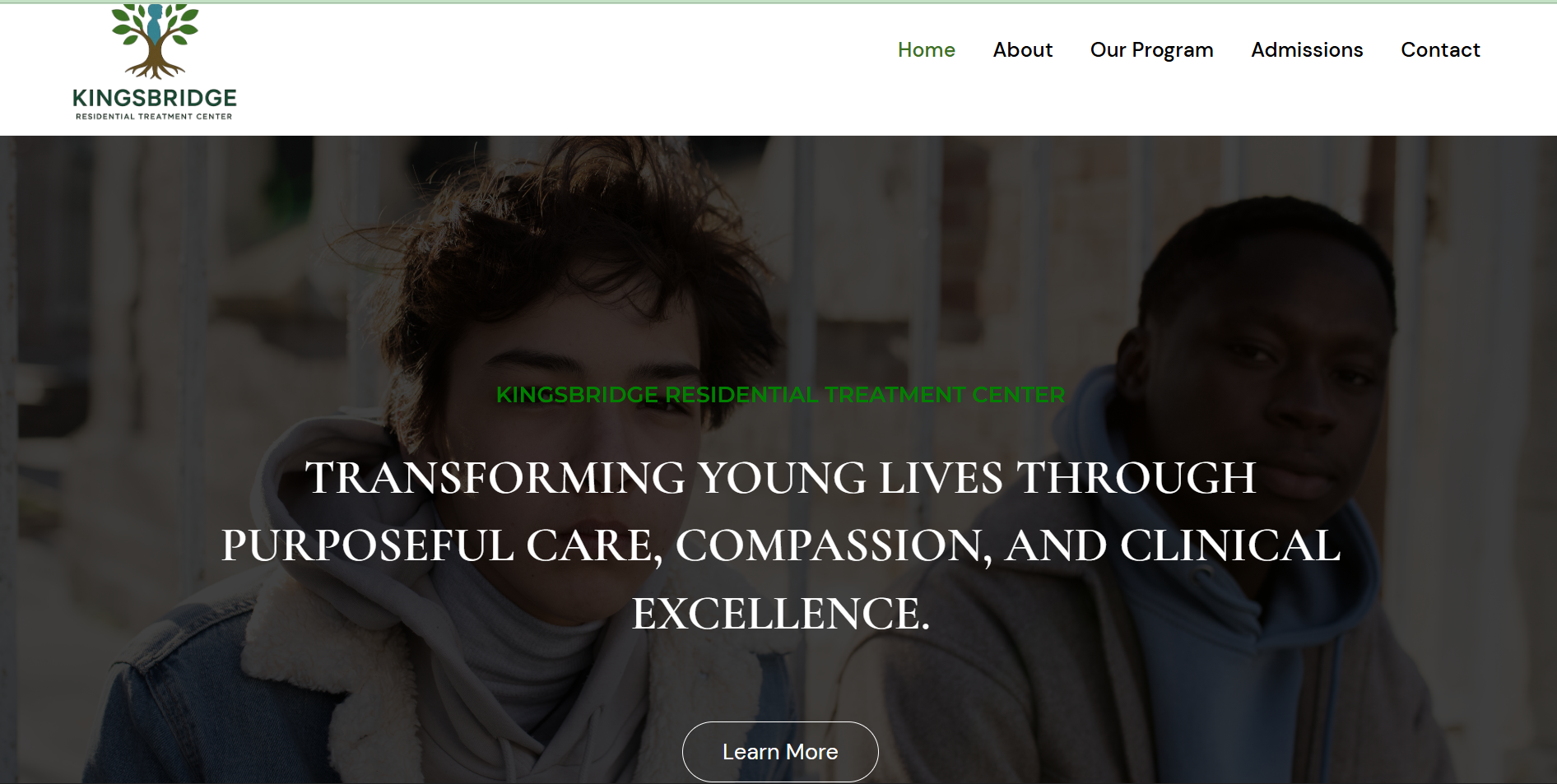
Project: Website Design for Kingsbridge Residential Treatment Center
This project involved designing a professional and compassionate WordPress website for Kingsbridge RTC, a center in Houston, Texas, dedicated to providing hope and healing for boys aged 7-17 who are navigating emotional, behavioral, or trauma-related challenges.
The Goal 🎯
The primary objective was to create a safe, hopeful, and user-friendly online resource for families in crisis. The website needed to clearly communicate the center’s mission, detail its evidence-based and trauma-informed programs, and provide a clear and supportive admissions pathway for parents and caregivers.
Design Strategy & Solution 💡
My design approach focused on building immediate trust and conveying a sense of compassion and professionalism.
User Experience (UX): I developed a clean, structured layout with intuitive navigation. This ensures that families, who are often under stress, can easily find vital information about the center’s philosophy, the specific therapies offered (“Our Program”), academic continuity, and the admissions process. The information architecture is designed to be reassuring and straightforward.
Visual Design (UI): The visual identity was crafted to be professional, calm, and supportive.
Color Palette: A calming and professional color scheme (likely featuring blues, soft grays, and clean whites) was chosen to inspire trust and a feeling of safety.
Typography: Clean, gentle, and highly legible fonts were selected to ensure all important information is accessible and easy to read, reducing any potential overwhelm.
Imagery: The site likely uses authentic, hopeful imagery of spaces and interactions (while respecting privacy) to foster a connection and reinforce the center’s nurturing environment.
Call to Action (CTA): Prominent and clear calls-to-action are placed throughout the site, such as “Contact Us” or “Learn More,” making it simple for families to take the first step and connect with the admissions specialists for support.
The Outcome ✨
The final result is a professional, empathetic, and impactful WordPress website that serves as a vital first point of contact for the Kingsbridge RTC. It effectively tells their story, builds trust with visitors, and provides a clear, supportive pathway for families to begin their journey toward healing.
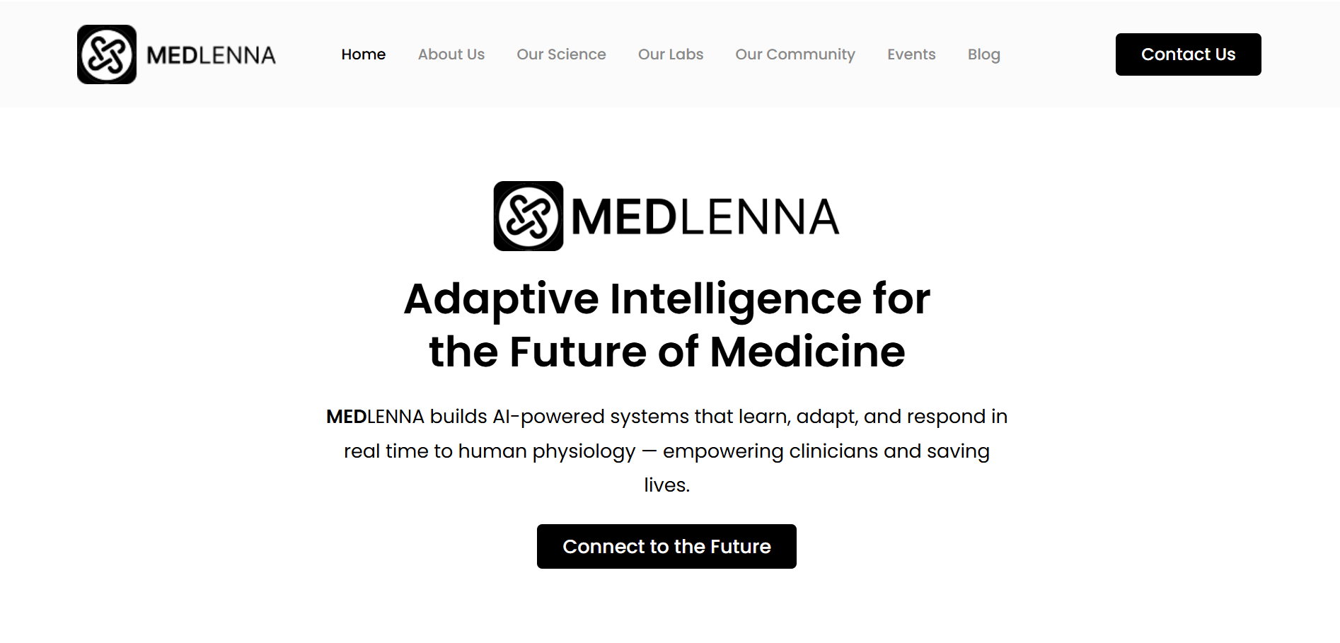
Project: Website Design for Medlenna
This project involved designing a clean, professional, and trustworthy WordPress website for Medlenna, a modern healthcare solutions provider.
The Goal 🎯
The primary objective was to create a seamless and intuitive online experience that effectively communicates their innovative approach to healthcare. The website needed to allow users to easily access their services, find information on health events, book appointments, and build trust in the brand.
Design Strategy & Solution 💡
My design approach focused on creating a user-centric, credible, and calming digital environment.
User Experience (UX): I developed a user-centric layout with clear navigation. This ensures that visitors can effortlessly find information about their offerings, book appointments, access patient resources, and stay informed about upcoming health events through a dedicated events section.
Visual Design (UI): The visual identity was crafted to be calming, professional, and credible.
Color Palette: A sterile yet inviting color palette of blues, whites, and soft grays was used to build a sense of trust and professionalism.
Typography: Clear, legible, and modern fonts were selected to ensure all information is accessible and easy to read, reinforcing the site’s authority.
Imagery: Professional, high-quality imagery was used to represent their services and team, fostering a sense of reliability and care.
Call to Action (CTA): Prominent and clear calls-to-action are strategically placed throughout the site to guide users toward key actions, such as “Book Appointment” or “Learn More.”
The Outcome ✨
The final result is a polished and impactful WordPress website that serves as a powerful tool for Medlenna. It successfully builds patient trust, positions them as a reliable leader in the healthcare industry, and provides a clear hub for both services and community events.
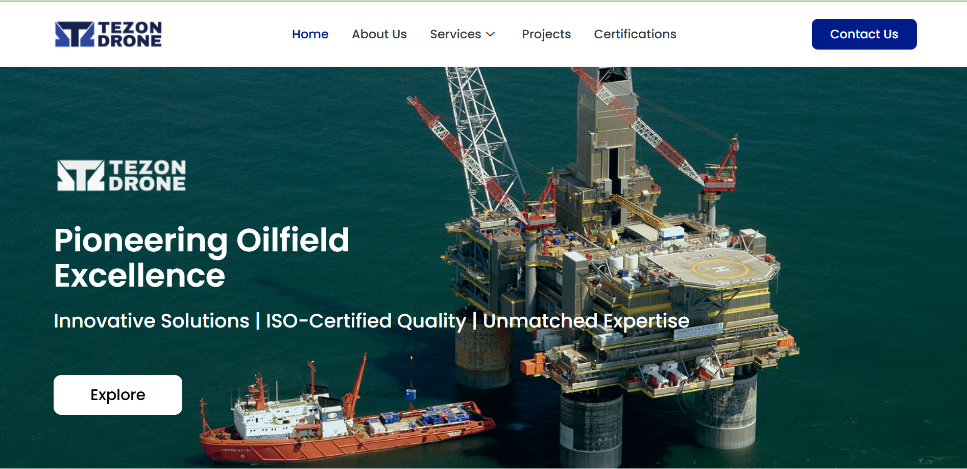
Project: Website Design for Tezon Drone
This project involved designing a dynamic and professional WordPress website for Tezon Drone, a cutting-edge drone technology and services company.
The Goal 🎯
The primary objective was to create a sleek, modern, and informative website that establishes their brand as an industry leader. The site needed to effectively showcase their technical expertise in areas like aerial surveillance and cinematography, and to function as a primary tool for generating qualified leads.
Design Strategy & Solution 💡
My design approach focused on creating a high-impact, futuristic, and credible digital presence that immediately communicates their capabilities.
User Experience (UX): I developed a clean, user-friendly layout with intuitive navigation. This allows potential clients to easily explore the full range of drone services offered, view a portfolio of past projects, and understand the technology they use.
Visual Design (UI): The visual identity was crafted to be futuristic and tech-focused.
Color Palette: A sharp, professional color palette (likely featuring dark tones, blues, and white) was used to convey precision, technology, and reliability.
Typography: Crisp, modern, and highly legible sans-serif fonts were selected to reinforce the technological theme and ensure readability.
Imagery: The design is built around high-impact, professional photography and video footage showcasing the drones in action. This immediately demonstrates their capabilities and the quality of their work.
Call to Action (CTA): Prominent and clear calls-to-action are strategically placed, such as “Get a Quote” or “Contact Us,” to guide visitors toward consultation and conversion.
The Outcome ✨
The final result is a powerful and engaging WordPress website that serves as a 24/7 lead-generation tool. It effectively highlights their innovative capabilities, builds trust with potential clients, and solidly positions Tezon Drone as an expert in their field.
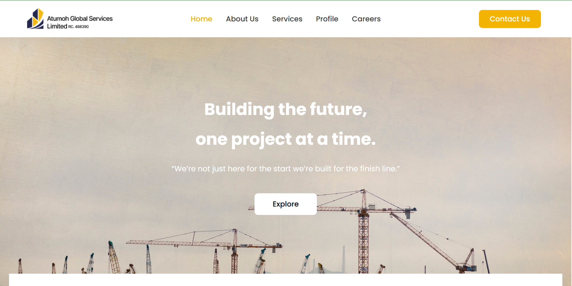
Project: Website Design for Atumoh Global
This project involved designing a professional and corporate WordPress website for Atumoh Global Services Limited, a multidisciplinary company specializing in civil engineering, oil & gas support, and project management.
The Goal 🎯
The primary objective was to create a strong, credible, and user-friendly online presence that would establish Atumoh Global as a reliable leader in their field. The website needed to clearly articulate their diverse range of high-stakes services and effectively convert potential B2B clients by showcasing their expertise and sector-specific solutions.
Design Strategy & Solution 💡
My design approach focused on building immediate trust and professionalism, appropriate for their commercial, industrial, and public sector clientele.
User Experience (UX): I developed a clean, structured layout with intuitive navigation. This ensures that visitors can easily find detailed information on their core services, including Civil Engineering, Oil and Gas Support, and Procurement. The information architecture is designed to logically guide potential clients to the solutions they need.
Visual Design (UI): The visual identity was crafted to be professional, corporate, and trustworthy.
Color Palette: A strong, professional color scheme (likely featuring blues, whites, and grays) was used to convey reliability, engineering precision, and corporate stability.
Typography: Clean, modern, and highly legible sans-serif fonts were selected to ensure all technical information and service descriptions are accessible and easy to read.
Imagery: The design strategically uses high-quality, professional photography of their projects, industrial sites, and engineering work to build credibility and showcase their capabilities.
Call to Action (CTA): Prominent and clear calls-to-action are placed throughout the site, such as “Learn More,” “Explore Our Services,” and “Contact Us,” to guide visitors toward engagement and lead generation.
The Outcome ✨
The final result is a polished, professional, and impactful WordPress website that serves as a powerful digital sales tool for Atumoh Global. It effectively communicates their expertise, builds client confidence, and positions them as a trusted, large-scale project partner in the engineering and energy sectors.
All reviews
Testimonials from our valued clients
“Thanks for your patience, I was almost giving up on if you can deliver what I want, But you turned it around”
IK
CEO Kingsbridge RTC
“From start to finish, the experience was seamless. Agbolahan turned my Figma design into a perfect live WordPress site. Every section matched my vision, and the site loads beautifully on all devices.”
Johnson
Product Designer
“He built our e-commerce store from scratch and made it so easy to manage products and payments. I love how clean and professional it looks. Sales have actually improved since the redesign!”
Jibola
CEO Jibson Clothing
“Agbolahan transformed our outdated NGO website into a modern, engaging platform that truly represents our mission. He communicated clearly, delivered on time, and went above and beyond.”
Elizabeth
Founder PTCF
“Beyond just creating a beautiful website, he helped me understand how to update and maintain it. His support after delivery was exceptional. Definitely someone I’ll work with again.”
Mary
Developer
“I’m really impressed with how fast and responsive my website is now. He fixed issues that had been slowing my site down for months. Excellent communication and attention to detail!”
Sia
Business Woman
Let’s create something amazing together.
Whether you’re launching a new business, upgrading your website, or need expert maintenance — I’m here to help.